Saturday, June 30, 2012

Hannah Eberts: From 60s and 70s Inspiration to Modern Creation


            I have always been inspired by fashion, pattern, color, and jewelry. I was excited to use this class and resulting research as a time to broaden my visual vocabulary of 1960s and 70s fashion and jewelry. My overall goal for this project was to examine a broad spectrum of fabric and jewelry from the era, and find a set of motifs and trends that inspire me. I then employed these and innovated them into creations of my own. I was eager to progress my personal jewelry making skills, and push my boundaries into creating bold pieces unlike anything I’ve made before. Likewise, I have developed a certain style in my surface designs, and I was ready for the challenge of integrating new motifs and patterns in my work.

            Through examining numerous visual sources, I was able to gain both a deep and broad understanding of the fabrics and jewelry of the era. I looked at many books, websites and catalogues, as well as having a first-hand look at the inspiration in various vintage stores of the area. After having gained such an expansive visual vocabulary, I was able to define my personal aesthetic for the project and from that develop a clearer sense of which specific inspirations I would 
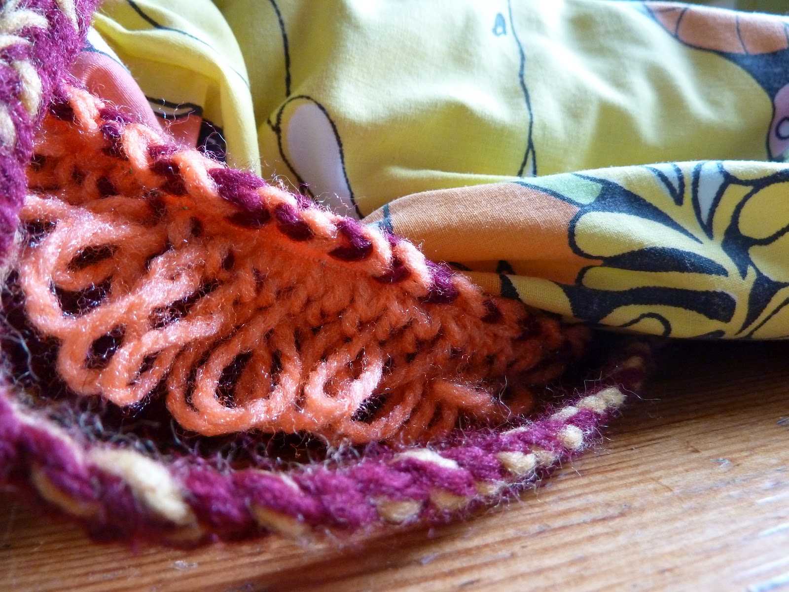
work with. For the first piece of jewelry, I was inspired both by the large use of fringe during the era, and also by a mixture of Eastern ethnic jewelry. For the second necklace, I wanted to make a large collar out of braided and woven rope, influenced by the early works of Alex and Lee, along with a heavy chest 
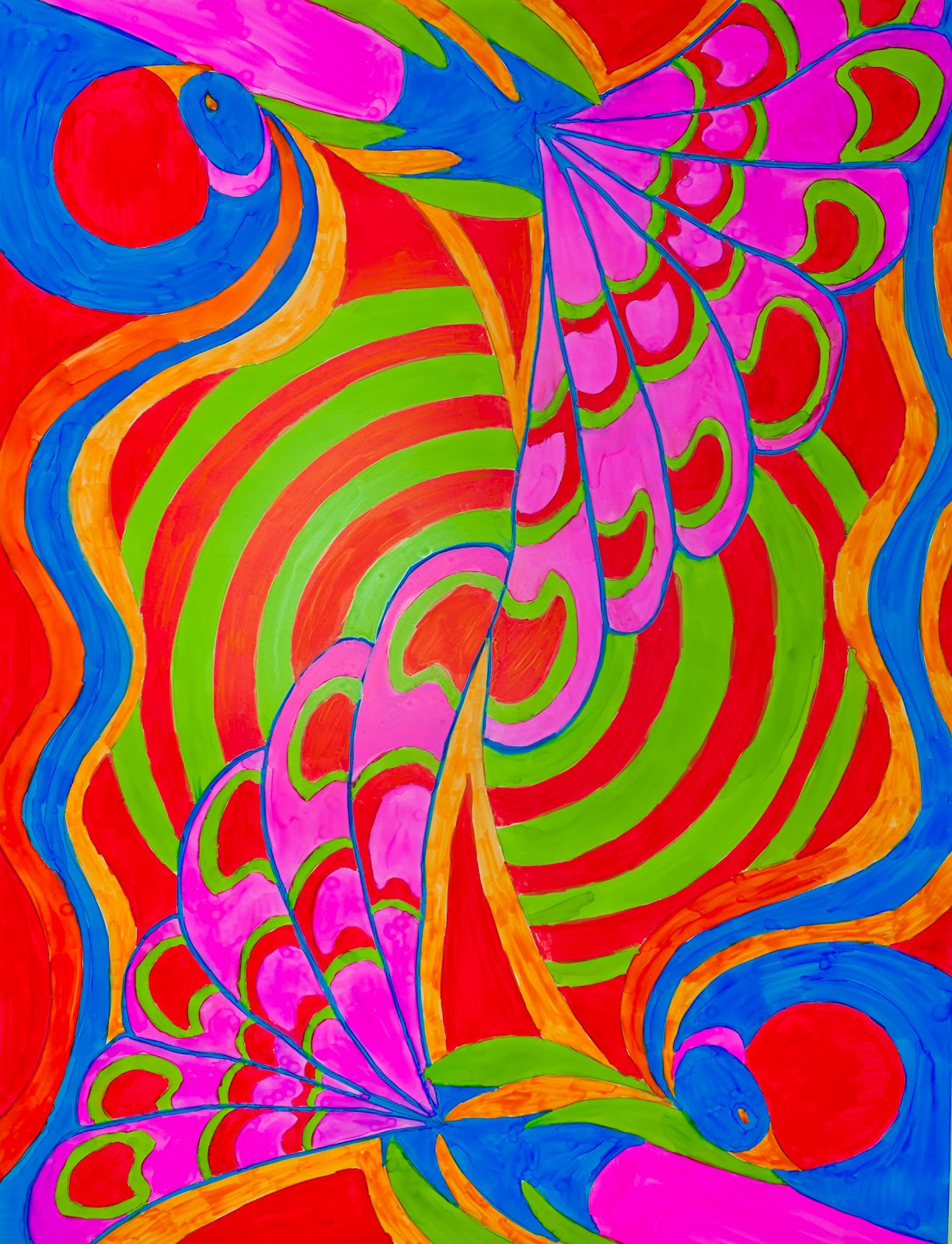
piece reminiscent of a Native breastplate. I referenced many motifs of Art Nouveau for the fabrics I created, because I found that in the 60s and 70s there was a resurgence of Art Nouveau not only in textiles, but also in prints and posters. I also used the shibori method of itajime because I noticed an interest in Asian surface design techniques in the 60s, such as the typical tie-dye associated with the hippies.   Lastly, I featured flower motifs on both of my yardages because I found that many of the textiles of the era had nature patterns. Overall, this project emboldened my style and pushed my creativity and technique to a new and more inspired level.


Michael Fogarty: Counter-Culture of the 1960’s and the Creative Revolution of Advertising

Abstract

There exists a peculiar relationship between the counter-culture of the 1960’s and the cooptation movement employed by the advertising industry of the same time.  That, contrary to notions of the cooptation movement as a purely capitalist endeavor, the cooptation movement was itself just an extension of the counter-culture movement.  That counter-culture goes beyond our commonly accepted definition, reflected in the “hippie” or “flower-child” ideals of the time, and can be extended to any aspect of society.   Of course this can only accomplished by first accepting “counter-culture” as anything that subverts the traditions of a previous generation in favor of new ones.   It is then the goal of counter-culture to create a new world, through its rejection of the old. 

Now if one was to examine the advertising industry of the 1960’s, in this same view of the counter-culture, one will see the cooptation movement as nothing more than an extension of the counter-culture.  However, this may not seem readily apparent when viewing cooptation alone but must also be viewed in context of the Creative revolution, which rocked the foundations of the advertising world, in the 1960’s.  Therefore, the cooptation movement and creative revolution should be seen as much as part of the counter culture as we do with the “back to the land” movement or the “Craft” movement.   That, although cooptation had its capitalist uses, cooptation, buoyed by the creative revolution, fundamentally challenged and opposed the modes of advertising employed by its predecessors.  That, advertising of the 1960’s rejected the hierarchal structure and scientism of the 1950’s and instead held the creative mind of the artist above all, in the same way that the counter-culture of the 1960’s rejected the imposition of structure and conformity of the 1950’s.  For the counter-culture movement and the advertising world of the 1960’s, to be different was, above all else, the lifeblood of its movement.


Michael Fogarty

To read the full paper, contact Michael Fogarty at mfogo89@gmail.com.

Mia Palabrica


This dress was inspired by the ethnic influences in the 1960’s. The choice of muted, earth deep tone colors that were mostly seen from other culture’s fashion piece. The use of embroidery as an embellishment represents the “ownership” of the dress. Embroidery was used in the counter-culture movement as a means to express oneself through fashion and craft. The dress was designed in a very simple manner, by taking a piece of fabric, dyed then sewn into something wearable was one of the basic approach during this era.


This is a mock-up dress I created for a fabric I designed that is inspired by the psychedelic art movement.


This is a fabric I designed that is inspired from the psychedelic art. The process of this design is to let the dye move on its own in the water without any manipulation. In order to create such kaleidoscopic effect, one must strategically position the placement of the dyes and let it run on its own. The design on my fabric is strongly cohesive as a whole that I wanted to leave it as it is and show different potential looks for it. 


Artist Mia Palibrica

Matthew Hicks


Project title: Developing and designing a more effective Native Funk & Flash online presence and performing market research for an expanded Native Funk & Flash.

Purpose: Native Funk & Flash's (NF&F) original beauty, spirit, and personality were incorporated into the website design through an adherence to simplicity and inclusivity. The website design strives to imitate the NF&F book design and provides an area for fans of the book to contribute to the website.

Website architecture


 The NF&F website is organized by Features, Pages, and Social Media. Features consist of individuals highlighted from NF&F. Pages consist of information about the book and functions to contact and search the NF&F website. The social media section consists of Facebook, Twitter, and a RSS feed.

Design principles and screen shots

To develop and design the NF&F website, I was guided by four interaction design principles. The principles were selected based on conversations with fans of NF&F, the author of NF&F, and other research. Here are the principles, accompanied with an example goal for which the principle corresponds, and how I met that goal with a design solution.

Principle #1: Understand Native Funk & Flash website Users and Support Their Goals

User goal: Find information about Native Funk & Flash.
Solution: Provide a Features section highlighting interesting individuals from the book.

Features section (NF&F homepage):


Principle #2: Make the Native Funk & Flash website Easy to Learn and Enjoyable to Use

User goal: Enlarge a website image.
Solution: Click on the image to enlarge. Click on the image again to exit the enlarged state.


Principle #3: Make the Native Funk & Flash website Collaborative and Inclusive

User goal:  Contribute to the NF&F website.

Solution: Provide the NF&F fans a blog to which they can contribute. 


Principle #4: Strive for Simplicity

User goal: Navigate the website easily without clutter.
Solution: Allow for adequate white space


Please note: the screenshots above were chosen to communicate design principles. The following screenshots are not included in the discussion on design principles, but are for the class website:


Social media


To assemble a NF&F online audience, I have built a social media platform using Facebook and Twitter that could grow in time. An online audience is an asset to any author who wants to sell books. In addition, I have created a blog where the NF&F author Alexandra Hart can discuss her recent work and have scheduled NF&F tweets through the Hootsuite application to be published throughout the summer.

Matthew Hicks


Skylar Thompson


Artist Skylar Thompson

Alexa Vargas: Psychedelic Prints in Chic Clothing

Color in Motion
Playful swirls and free flowing colors in harmony like in psychedelic visions.

Spinning Peacocks
Description: Intertwining psychedelic peacocks in the state of motion.


Splash of Color
Description: A constant wave of glowing colors cascading in psychedelic forms.


 Flowers and Circles
Elegant lilies and poppies in Art Nouveau with a mix of psychedelic colors creating lively patterns.

 Flowing Swans
Swans in a flowing river with water lilies and curvilinear forms in Art Nouveau with a touch of psychedelic colors.

Flower Child
A peaceful women who lives with nature in Art Nouveau with vivid psychedelic colors.

Artist Alexa Vargas