This topic will explore the different methods that were used
to promote 1960’s and 1970’s fashion or how it represented the brand. This
topic will also analyze design elements such as the font and layout that were
used. An objective of this research is to compare and contrast the
advertisements used in mainstream publications such as Vogue, Life, Elle etc.
magazines and counter-culture publications such as Helix and Rags. In addition,
I will also analyze the advertisements of today in a modern issue of the very
same magazines.
The following images will be organized in 8 sets of 2 images
with each set representing a category. The first image will juxtapose three
advertisements against each other (Mainstream vs. Counter-culture vs. My
Interpretation.) The second image will be a close-up of my interpretation.
THE DRAWING
1 Both are advertising clothes but one has a realistic
approach with structured text while the other has an illustrative approach with
handwritten texts.
2 I combined the feminine figure of the illustration from
the mainstream advertisement with the overlaying texts element from the
counter-culture advertisement. There were colored illustration ads but this one
was black and white to keep this set consistent.
THE TRIANGLE
3 The idea of the pubic triangle is often used in
advertisements that sell jeans, stockings and shoes.
4 A similar interpretation but a mosaicked rear view to
emphasize the nudity in the counter-culture ad that is often not seen in
mainstream ad.
THE PERFUME
5 MS perfume ads often display attraction and seduction
while CC perfume ads are more about bring their own personality out and being
themselves.
6 In my interpretation, the girl is seductive, but also being
herself.
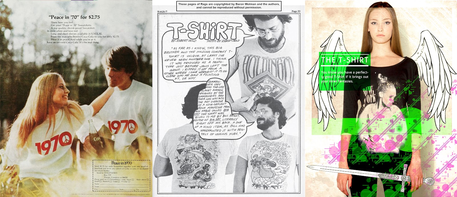
THE T-SHIRT
7 Another example of font vs. hand-drawn/written. Notice the
amount of detail and content on the T-shirts on the CC ad.
8 Again, I combined the hand-drawn aspects with the
mainstream icons.
THE SMOKING
9 Cigarette ads in MS often sells that its ok to smoke and
often as an act to show power and be rebellious. However, smoking in CC ads is
often about relaxation and finding the inner peace.
10 Here, I have a girl enjoying a cigarette not as an act
but just because she is doing so to relax.
THE FIGURE
11 The way woman are represented in MS ads often display
perfect figure with a sexual tone. Never will an ad in MS magazines display a
pregnant lady.
12 The lady in this ad has her figure subtly altered as you
move to right. This is to emphasize that the audience is often blinded by the
presentations by ad companies and we never recognize anything else.
THE MEN’S
13 The choice of models of men is often Hollister-style or
masculine and to have an overweight man in bellbottom pants is very
counter-culture.
14 I combined the idea of a fine looking man with clothes
and pants from different styles highlighting the fact that man and woman don’t
have to always dress one way or the other.
BETSEY JOHNSON
15 Betsey Johnson was once a counter-culture fashion company
and even though it retains much of the flamboyant design, the way it is
marketed and advertised is completely different.
16 Finally, I combined elements pulled from both ads.